Basic functions
The application is usable in both desktop and mobile views, though the table layout differs slightly between the two environments. This chapter describes the following:
Summary row(s)
Display based on device type
Desktop view
- Tables are displayed in a traditional format, structured into rows and columns.
- Each row represents a single item, while columns correspond to individual data fields.
- Column headers appear at the top of the table and help users interpret the displayed information. (When you hover over the column header with the mouse, the full name of the column appears in a hint, making it visible even if the header is too narrow to display the entire name.)
- If the content of a field is not fully visible due to the column width, hovering the cursor over the field will always display its full content as a hint.
- Data fields of the table are called cells.
Mobile view
- On smaller screens, the table layout automatically adapts to a list-style format.
- Each item (row) is displayed across multiple stacked rows.
- Every data field appears in its own row, with the corresponding column name (e.g., “Performer”, “Title”, “Version”) shown as a label before the value.
- This format allows users to clearly understand each data point, even without visible columns.
- The transformation occurs automatically, no manual configuration is required.
- In mobile view, a filter icon (
 ) appears at the top of the table, enabling access to column selectors and headers used for filtering and sorting.
Throughout this documentation, rows are referred to as items, and the fields within each item are referred to as columns. These correspond to the cells in the desktop view.
Pagination
If the number of items exceeds what can be displayed on a single page, pagination is applied. Navigation buttons appear at the top of the table to switch between pages.

On mobile devices, users can also swipe horizontally to move between pages.
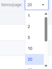
Items per page setting
Users can select how many items to display per page using the dropdown menu labeled “Items per page.”
This setting allows for a customized viewing experience for example, displaying fewer items on smaller screens for better readability.
On mobile, users can scroll vertically to navigate between items on the same page.
The default setting is generally 20 items per page.
Item count
The bottom-right corner of the table displays the number of visible and total items, for example:
“Items: 12 / 45” – the first number indicates the number of items currently shown (after filtering), while the second represents the total number of items.
Summary row(s)
Some tables include a summary section at the bottom, which aggregates data across the table. This summary may consist of one or more rows, depending on the table’s structure.